Difference Between Table and Chart

Information is the greatest tool in the world which can help nations turn their fortunes. Data when converted into properly structured information can be useful in many aspects and can be brought to use in any field of life.
There are many ways of showing data as information which is easy to understand and can be used for any purpose. Often tables and charts are used for this purpose. The two of them have been around for ages but still provide excellent tools when it comes to dealing with numbers.
The two terms are often used together and although they perform similar functions, they have their differences.
Tables deals with representation of data in rows and columns whereas the chart offers graphic representation in the form of pie, bar and line shaped amongst other options. Deciding to use either a table or chart is based on the type of data that you will like to visually represent.
Tables can be quite simple as well as complicated and multidimensional. Graphs on the other hand are generally not very complicated and you must know what they represent to easily understand the data or information that it represents.
Tables show data in various fields and the numbers that have been generated as a consequence of a survey in a business or other aspects of life. The components of a chart show large amounts of data through graphic representation.
There is little text in the charts only to mention portions whereas the tables are based on the numbers.
Instructions
-
1
Table
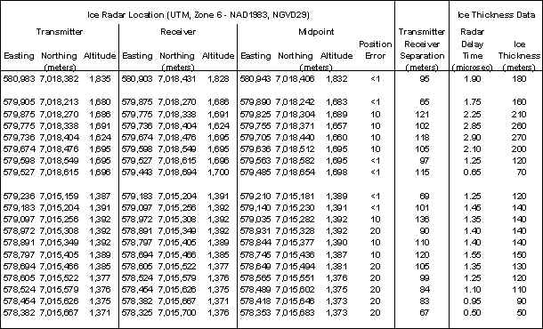
Tables are the arrangement of data into rows and columns. They carry important information which is often used for the purpose of decision making.
A table can be handwritten, typed or printed. Various computer software offers some great tools to easily make tables and analyse them.
There are many types of tables which can be very simple or basic with little data to advanced or cumbersome ones that contain loads of information.
- Image Courtesy: ak.water.usgs.gov
-
2
Graph
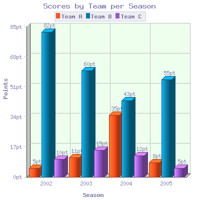
It is a way of presenting complex data in simple graphical representation which is easy to understand. Graphs have been around for centuries as they are the best way to look at a set of data and visually compare this information.
There are many different kinds of graphs and the ones that suit the scenario best are used to explain the information. It is an excellent way of analysing a situation and make decisions on the basis of it.
- Image Courtesy: jpowered.com


