How to Design a Gallery Retail Store

The ability to paint and create lovable and deep art is not one that everyone possesses. It takes a lot of time, effort and thought that goes into each piece of art and obviously, artists wish for recognition and eventually, hope for someone to appreciate their work with money.
A gallery retail store is one of the best ways to let the world know of your artistic qualities and show them how unique your stuff really is. Even if you are not an artist, setting up a gallery retail store is not as hard as you may think.
With a right amount of space and a design to attract even the most least concerned with art sort of people, you can set up a gallery retail store that has unlimited potential and earning ability.
Instructions
-
1
Art Should Be the Main Focus of Attention
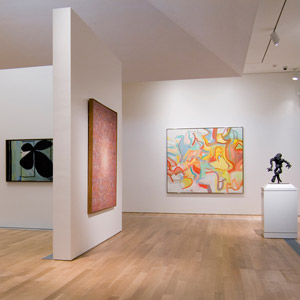
The first and foremost aspect of any gallery retail store has to be that each and every potential customer that walks should have all his/her attention focused on the art and not anything else that would distract them. Keeping that in mind, a subtle colour should be chosen for the walls and nothing to eye catching should be used. Paint should be as such that it brings out more life into the paintings and not to the wall itself. -
2
Lights Everywhere
Having a dull look will only ruin the experience for the people coming into your gallery retail store. Lighting is extremely important and should be placed to bring out the true colours of the painting and supplement the beauty of the work.
Buyers in the end are not coming into see how the interior designing is working to your advantage, they want to see the paintings and may be even want purchase some of them. -
3
Paintings Should Not Be Crowded
Each and every painting should have its own personal space and not be crowded in a single area with a bunch of others. It is all about focusing the attention on one piece at a time and crowding them will only confuse the buyers. -
4
The Store Should be Artistic
Like the walls and paintings, the whole area should be subtle and clean. A few chairs that accommodate the look and even a little memorabilia area with light, soft music in the background, should be neat and spacious. This will only bring the buyers coming back for the paintings and environment.


