London Olympics 2012 Logo Design
Olympics, being the oldest and one of the biggest sports events, has undergone a variety of changes. Many new games were included over the years and of course, the number of participants also increased. Other than the structural changes, there emerged changes in designs, colors and presentation as well. While talking about these changes, it’s hard to stop discussing the logo itself that underwent major developments. Since 1924, every Olympics event had its own unique logo and so there’s a special logo for London 2012 Olympics.
This logo is mainly important because of the cost incurred, i.e. £400,000 and a long controversy that hit the media.
Instructions
-
1
Who designed London 2012 Olympics Logo?
Wolff Olins designed the London 2012 Olympics brand identity. The designer company is one of the top 40 places to work for in the media and marketing industry according to Adage.com
-
2
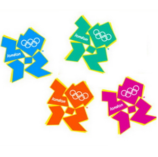
The Colours:
The standard colours of 2012 London Olympics are Green, Magenta, Orange and Blue; however the logo has incorporated a variety of colours, including the Union Flag to promote the handover ceremony. The flexibility of the logo has also enabled sponsors like British Airways, Adidas and Lloyds TSB to incorporate their corporate colours into a personalised version.
-
3
Olympics Rings in Logo; Symbols & Meanings:
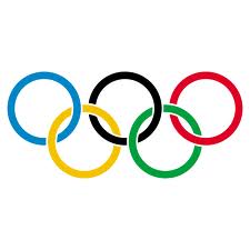
All the Olympics Logos contain Olympics Ring, which means something special. There are five rings in total; representing five continents, and the colors are used for the flags of participating countries. For instance, Blue and Yellow represent Sweden, while the Blue and White stand for Greece, France, UK, USA & Germany and so on. It is certainly an international symbol and the way in which the rings are joined, it exhibits the nations' unity.

-
4
London 2012 Olympics Logo Controversy:
Early public reaction to the logo, as measured by a poll on the BBC website, was largely negative: more than 80% of votes gave the logo the lowest possible rating. A blogger on BBC said that "London 2012's new logo has got the country talking not in the manner the organisers would have hoped." On the other hand, an employee at a design firm described it as "well thought out" and anticipated it would "become a source of pride for London and the Games."
There's been hype in the media too about Iran threatening to boycott the games since according to them, the logo spells 'Zion,' reflecting Israel's conspiracy.
The logo also faced a lot of controversies, i.e. from its resemblance to Simpsons engaged in sexual act to Swastika. -
5
2012 London Olympics Logo & Businesses:
Being available in many colours, allowing businesses to blend the logo in their own color schemes for promotions, the 2012 London Olympics Logo is said to have major sales accelerating force for many businesses. Back in October 2008, it was reported that clothing branded with the logo accounted for 20% of sales at Adidas' flagship Oxford Street store, despite occupying just 5% of floor space.


